
There’s a topic of conversation that continuously cycles its way around the Vintage Kitchen. It involves disconcerting colors, one-dimensional shapes, and awkward arrangements. It combines presentation and food props and fussy table settings. And it is the ultimate make-or-break factor in the exploration of a recipe or the selection of a cookbook.
In today’s post, we are diving into the world of 1950s food photography to figure why exactly that decade’s imagery has not translated well to our modern day sense of food aesthetic. Was the camera equipment to blame? Or the food styling? Or an outdated sense of table display? Not necessarily. Through the dissection of one color photograph on the cover of a cookbook published in 1950 and a little research into the field of vintage photography, we discovered one simple reason why food photos of the 50’s lack the luster to ignite our appetites today.
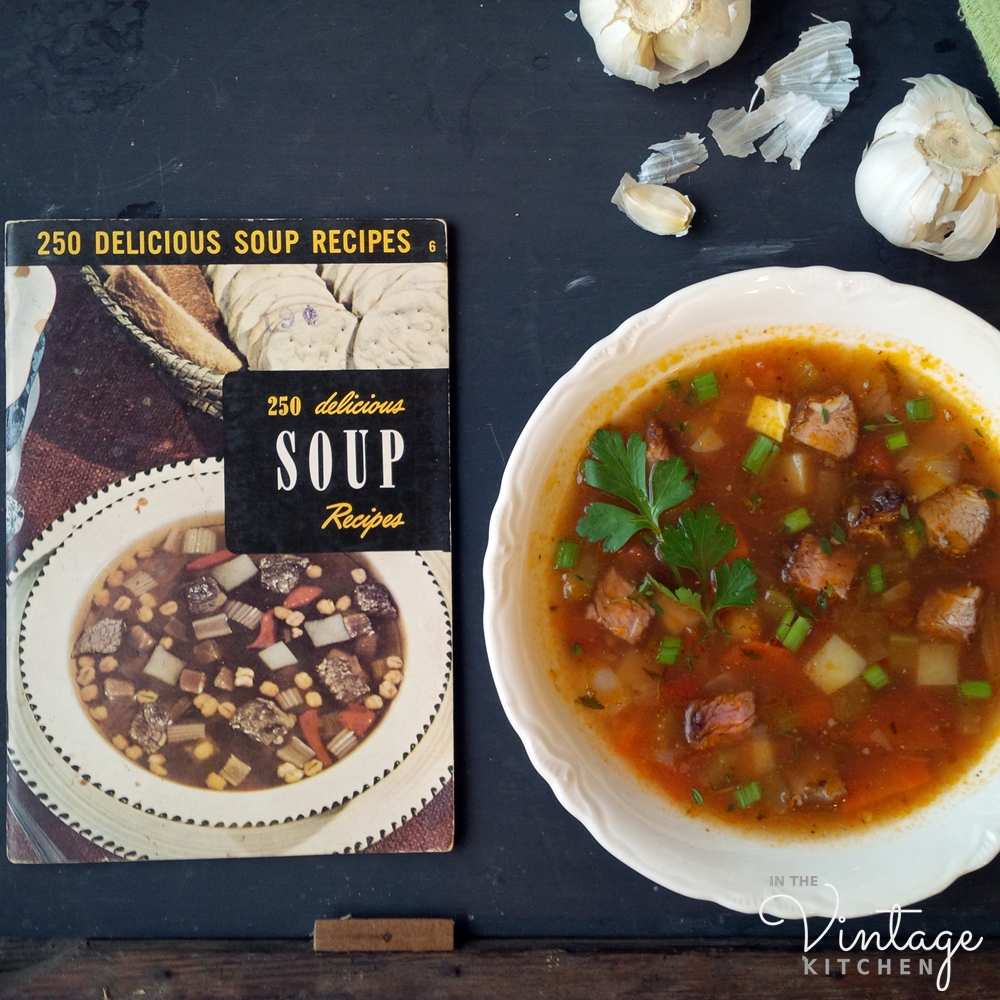
This is the photograph that spawned the conversation…
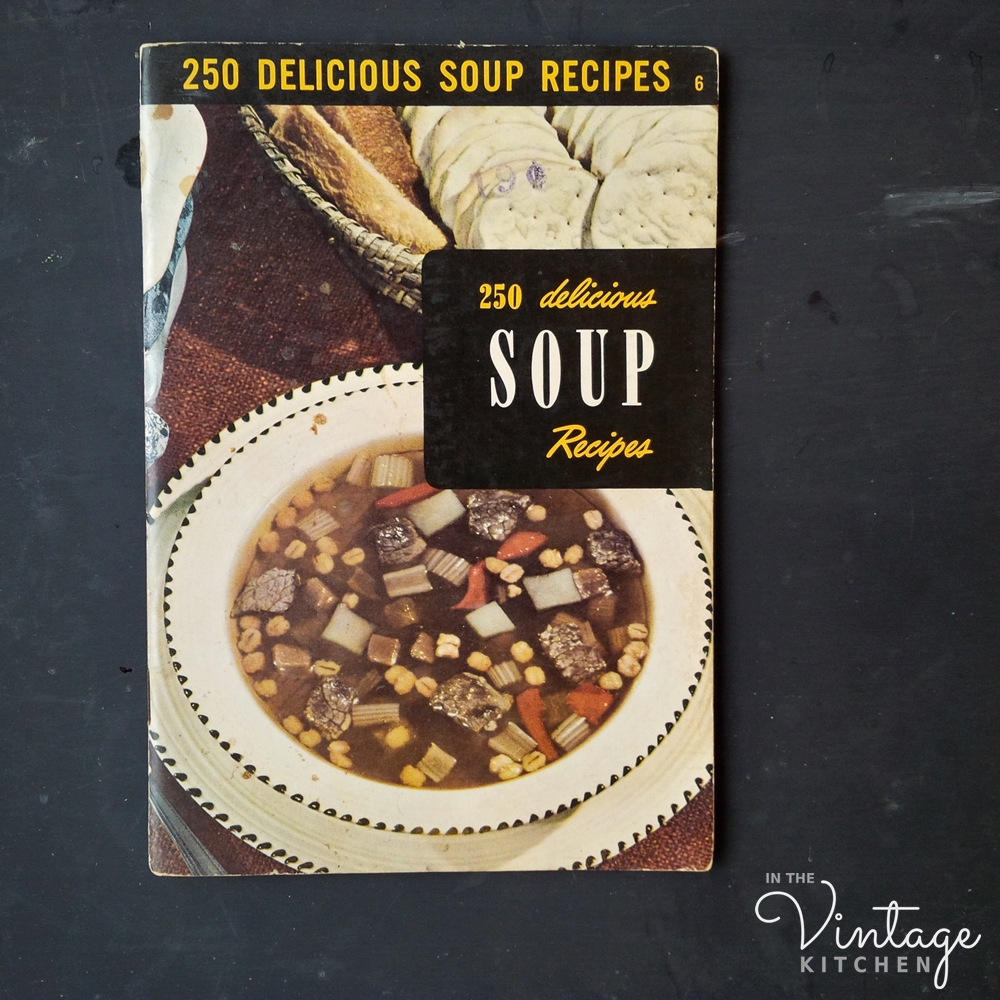
With it’s floating concoction of grey meat, beige celery, yellow corn (which actually turned out to be barley), cubed potatoes and a shapeless, unidentifiable rust-colored vegetable (are they carrots? or red peppers? or tomatoes?) this poor soup, the cover star of the cookbook, didn’t have much going for it in the boy-this-looks-delicious-department.
Published in 1950 by the Culinary Arts Institute, an organization devoted entirely to the science of better cookery, the 250 Delicious Soup Recipes Cookbook was edited by Ruth Berolzheimer, a woman who spent the majority of her life writing about food and experimenting with flavors and ingredients. The recipe featured on the cover was a classic crowd-pleaser perfect for the winter kitchen – Beef and Barley Vegetable Soup – which combined homemade broth, and a variety of vegetables and herbs.
Technically, our cover star soup had everything going for it – complimentary ingredients, expert cooking knowledge and a trusted company to back it up. So how is it that it wound up looking like something you would never want to voluntary make or eat? Is this really what an actual bowl of beef and barley soup looked like at the dinner table in 1950? Further investigation was needed.
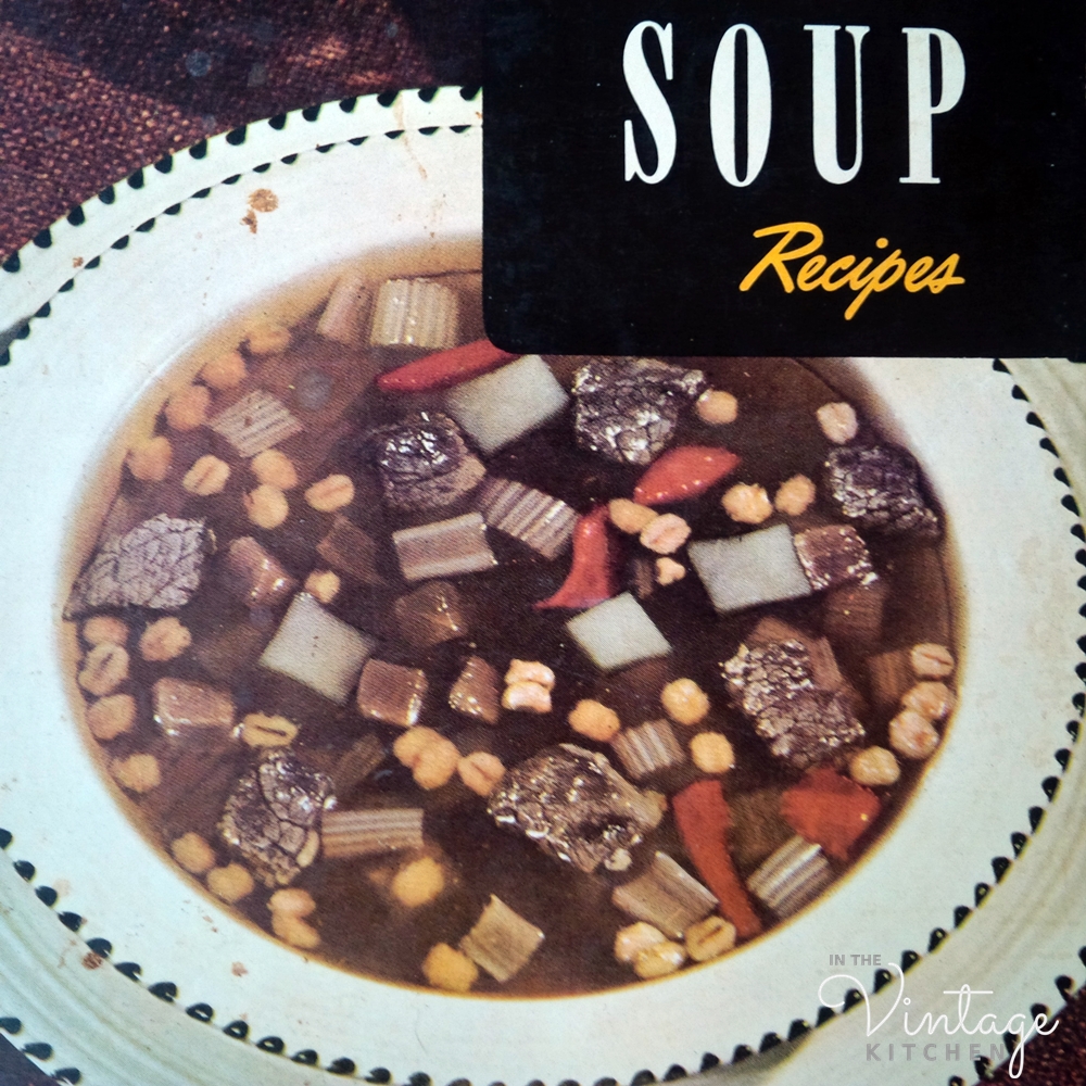
We began first with the physical appearance of the photograph, thinking that maybe it was the camera that yielded an unappealing portrait. Afterall, cameras weren’t as sophisticated back then as they are today, and photo editing software didn’t exist and the ability to capture compelling, exacting details in a crisp, clear way was much harder than it is now. But then we remembered about the food photography of Edward Weston, who took pictures like this in the 1930’s…
and we realized that technical abilities of the vintage camera couldn’t be blamed. This cabbage photograph has plenty of compelling, exacting details and it was taken two decades before the beef and barley soup recipe ever came to fruition.
Next, we thought maybe it was the ingredients that doomed the soup’s ability to ever look pretty right from the very beginning. So we prepared the same exact recipe with the beef and the barley and the rusty red vegetables (which turned out to be carrots and tomatoes). We added the celery, the potatoes, the onions and the fresh thyme and parsley the recipe called for. It was all the same but it was different because our soup turned out looking this…
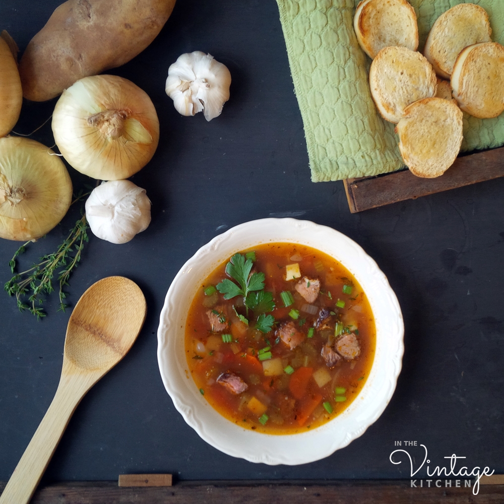
Not a grey lump in the batch and lots of color. The difference between the old photo and the new one instantly made us feel better for the soup eaters of 1950. Perhaps, they weren’t eating bland looking food after all.
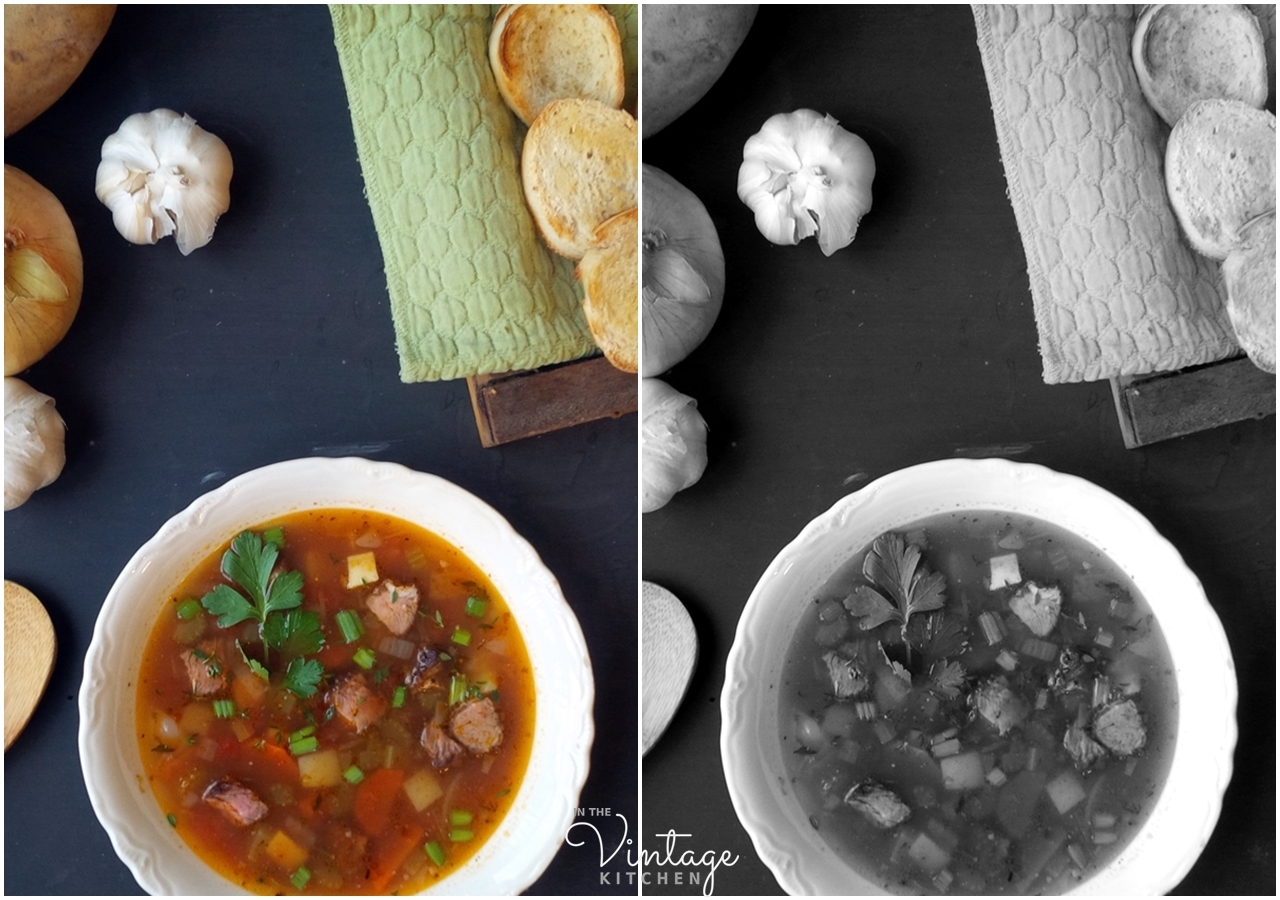
So how could the same recipe look so different? How could one be grey and murky and the other be bright and vibrant? The answer is black and white, literally.
As it turns out 1950 was the decade when color photography was just beginning to become more affordable and more mainstream. Up until then, black and white film ruled the medium and photographers excelled at setting up shots that looked great in dramatic, colorless settings. They relied on subjects and styles that would translate bold shapes and dramatic lighting and bring crisp clarity to their compositions in order to reproduce a striking image. This explains everything about our cookbook cover. When we changed the photograph from color to greyscale look how much more appealing the soup became…

Instead of focusing on the colors in the soup, you automatically focus more on the shapes floating in the broth and the overall symbiosis of the whole presentation. That means food stylists, or home economists as they were known up until the mid-1950’s, were used to thinking in the same black and white way as photographers when it came to styling food for the camera.
In the late 1940’s and early 1950’s, color was something new to learn about and adapt to. It was a baby in a glass shop, a wild dog on a leash, an uncharted course to explore. It was wild and exciting and sexy, but most people didn’t really know how to work with it right away in order to make incredible, indelible images. It required a creative and visual skill set much different from what was learned and achieved through black and white photography. It definitely took time to master.
The cover of this 1950 cookbook is a striking example of using an old mindset on a new medium. Photographers and stylists were used to their past ways of setting up shots for a black and white end result. They were relying on bold shapes, and dark contrasts to tell a black and white story in color.
In the same vein, the soup we made in the Vintage Kitchen doesn’t look nearly as appetizing in black and white as it does in color because our goal was always to reproduce an image in color. In the black and white example, our soup now looks murky and lacks depth and definition.
So this brings us to a fundamental point. Don’t judge a book by its cover or a recipe by its photo, especially when it comes to midcentury vintage cookbooks. Food photography is an art form that grew into greatness over a long period of time but the recipes have always remained their humble selves.
Hopefully, if you are on the fence about old cookbooks this post will persuade you to give them another chance. The beef and barley vegetable soup may not have looked appetizing on the 1950 cover but it turned out to be delicious in our modern making of it, proving that looks can be deceiving even when it comes to cookbooks.
Cheers to kitchen surprises and food photographers!
—
Interested in more unexpected kitchen adventures? See what we learned when we explored the land of molded gelatin salads this past summer here.
Ready to experiment with some vintage recipes on your own? Find a bevy of vintage cookbooks in the shop here.


Love the posts… I was lead to the Jello Gelatin post… perhaps you should add that the Blender Cookbook is by Ann Seranne, would help find it via google and wouldn’t hurt to share the author. Also a great reference after reading today’s article on photography. Eileen Gadden and Ann were the first writer food photographer duo. At their peak they had a young Craig Claiborne working with them as an assistant. Some fun stories I’ve read about.
My blog is @RecipeLost on social media and here via link
https://subtropiccookery.wordpress.com
Respectfully, Jorge J. Zaldivar (786) 299-1934
>
LikeLiked by 1 person
Jorge – thank you so much for your tips and suggestions! I will definitely go back and amend the post. In the new year we’ll be doing a post on Ann Seranne and Eileen Gaden and their dynamic partnership, so stay tuned for that. And how fascinating about Craig Claibourne working with them when he was young. I didn’t know that. We are super BIG fans of his here in the Vintage Kitchen and have several of his cookbooks. Excited to go and visit your blog now – thanks for including the link – it’s lovely to meet a fellow cooking friend!
LikeLike
How interesting! Thank you
LikeLiked by 1 person
So glad you enjoyed the post! Thanks for popping in to say hello!
LikeLike
are u mad gril
LikeLike
What a fun article. I collect vintage cookbooks, but had never really sat down and thought about the differences in food photography, etc. Very enjoyable and informative.
LikeLiked by 1 person
It is lovely to meet a fellow vintage cookbook lover! If you have a range of decades in your collection you’ll notice how much more artistic food photography became in the 1960’s and 1970’s when food styling really began to take steam as a profession. Each decade added something new… the 1960’s – creativity, the 1970’s – scene setting, the 1980’s – mood lighting, the 1990’s – harmonious color arrangements. The 2000’s – are the ultimate culmination of all those past decades of learning and have resulted in some of the most beautiful food photographs that combine all of those elements in just one image. It is a fascinating progression and one that truly unfolds before your eyes. So glad you enjoyed the post! Thanks so much for stopping by to say hello!
LikeLiked by 1 person
So interesting! I have a few vintage cookbooks that my grandmother gave me and some of the covers are…questionable. However, the recipes really are delicious! Thanks for the good read.
LikeLike
Oh I’m so glad you said that about your passed-down cookbook covers. It’s one of the greatest misconceptions people have about old recipes. Here in the VK, we are on a mission to help these wallflower recipes get the attention they deserve – as you said more often than not – the recipes are delicious! So glad to have a fellow recipe collector join us on our adventures! Thanks for popping in!
LikeLiked by 1 person
Fascinating article. I often wondered why food photography looked so weird in the early 1950s, but your essay makes perfect sense. I couldn’t believe how much better the book cover looks in black & white vs colour!
Now I’m in the mood for a nice beef and barley soup…
LikeLiked by 1 person
Thank you so much! It was definitely a real “aha” moment of discovery for us in the Vintage Kitchen. It’s nice to meet a fellow soup fan! Stay tuned for some vintage recipes coming to the blog this winter.
LikeLiked by 1 person
nice post
LikeLike
Thank you so much! Glad you enjoyed it!
LikeLike